Click on the New Email button to begin creating a new Broadcast Email message. First, you’ll start in the General tab. Here, you’ll select your Audience and add
a Title for the message. Next, you’ll click on the Body tab. Here you will design the email message for your Broadcast. Finally, you’ll choose to either Send
the Broadcast immediately, Schedule a date and time for the Broadcast to send or Save as Draft.
The General Tab

Here you will select an Audience and add a Title for your Broadcast email message by configuring three elements:
- Audience Type – select an Audience type category/group from the drop down. Doing so will automatically include all contacts in that group as recipients.
- Audience – if you select Contact or Contact Group in Audience Type, you can specify a contact or contact group here.
- Title – create and add a Title for your Broadcast email
After you’ve selected your Audience and added a Title, click on the Body tab.
The Body Tab
Here you will compose the Broadcast Email message. There are three main areas under the Body tab:
- Appearance tab and settings
- Content tab and settings
- Message composer
Appearance Sub-tab
Here you can view and edit styling related attributes of your message. You likely won’t need to change most of the settings here, as the default values will give you
a nice, clean layout that works for nearly all your Broadcast messages.

- General Settings
- Message width – use set the width (in pixels) of your message. We recommend using the default value of 600px.
- Default padding – use to set the padding outside your message. We recommend using the default values of 20px.
- General background color – use to set the background color of the entire window surrounding the main container. We recommend using white (#ffffff) or the default light grey (#f6f6f6).
- Font – choose from several standard and non-standard fonts. We recommend you select a standard, “web-safe” font for consistency.
- Line spacing – use to set the vertical spacing between lines in a paragraph. There are 4 buttons to select from, ranging from condensed text to double-spaced.
- Paragraph bottom space – toggle on to add additional space at the bottom of each paragraph in your message. Default is off.
- Underline links – toggle on to underline all hyperlinks in your message. We recommend you keep this toggled on, which is the default setting.
- Responsive Design – toggle on to make your Broadcast message compatible all devices, including mobile devices, desktops, laptops, and tablets. Default is on.
- RTL text direction – toggle to support RTL languages. We recommend you keep this toggled off, which is the default setting.
- Background image – add a background image to cover the entire window surrounding the main container. We recommend you keep this toggled off, which is the default setting.

- Stripes - use to style the main page structure elements. Stripes are vertical slices of your message, separated into easy to manage areas. There are four stripes that make up a message:
Header, Content, Footer, and Info Area.
- Header – utilize this area for branding, contact information, and essential links. Settings for the Header Stripe will apply to all instances of the Header Stripe.
- Text size – use to set the text size for Header stripe text.
- Background color – use to set the background color of the Header stripe. Note that the background color will span the entire width of the page. The content area will remain centered. Default
value is transparent.
- Content background color – use to set the background color of the Header stripe content area only. Default value is white (#ffffff).
- Font color – use to set the font color of the main text in the Header stripe. Make sure you choose a color that stands out from your background color so the content is easy to read. Default is
dark gray (#333333).
- Link color – use to set the font color of hyperlinks in the Header stripe.
- Background image – use to add a background image to the Header stripe. The background image will only span the size of the header stripe content area.
- Content – place the main content of your message here. Settings for the Content Stripe will apply to all instances of the Content Stripe.
- Text size - use to set the text size for Content stripe text.
- Content background color - use to set the background color of the Content stripe content area only. Default value is white (#ffffff).
- Font color - use to set the font color of the main text in the Content stripe. Make sure you choose a color that stands out from your background color so the content is easy to read. Default is
dark gray (#333333).
- Link color - use to set the font color of hyperlinks in the Content stripe.
- Footer – utilize this area for social media links, copyright info, disclaimers, and important links back to your website. Settings for the Footer Stripe will apply to all instances of the Footer Stripe.
- Text size - use to set the text size for Footer stripe text.
- Background color - use to set the background color of the Footer stripe. Note that the background color will span the entire width of the page. The content area will remain centered. Default value
is transparent.
- Content background color - use to set the background color of the Footer stripe content area only. Default value is white (#ffffff).
- Font color - use to set the font color of the main text in the Footer stripe. Make sure you choose a color that stands out from your background color so the content is easy to read. Default is dark
gray (#333333).
- Link Color - use to set the font color of hyperlinks in the Footer stripe.
- Background image - use to add a background image to the Footer stripe. The background image will only span the size of the header stripe content area.
- Info area – utilize this area for further disclaimers, opt-out messages, etc. Settings for the Info area Stripe will apply to all instances of the Info area Stripe.
- Text size - use to set the text size for Info area stripe text.
- Font color - use to set the font color of the main text in the Info area stripe. Make sure you choose a color that stands out from your background color so the content is easy to read.
- Link color - use to set the font color of hyperlinks in the Info area stripe.
- Headings – set the font, line spacing, font size, and font style for each of the top three heading types
- Font - choose from several standard and non-standard fonts. We recommend you select a standard, “web-safe” font for consistency.
- Line spacing - use to set the vertical spacing between lines in a paragraph. There are 4 buttons to select from, ranging from condensed text to double-spaced.
- Heading H1 – set the font size, style (bold and italic) and the font color for all h1 in your message.
- Heading H2 - set the font size, style (bold and italic) and the font color for all h2 in your message.
- Heading H3 - set the font size, style (bold and italic) and the font color for all h3 in your message.
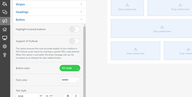
- Button - set the button color, hover color, roundness of corners, border, font, font size, and font style for your buttons
- Highlight hovered buttons – toggle on to set your buttons to change color when the user hovers over it.
- Support of Outlook – toggle on to ensure the most accurate display of your buttons in MS Outlook email clients.
- Button color – choose the background color of your buttons using the color picker. If you toggled ‘Highlight hovered buttons’ on, you will also see an option to choose the background color
of a highlighted (hovered over) button.
- Font color – choose the font color for your buttons using the color picker. If you toggled ‘Highlight hovered buttons’ on, you will also see an option to choose the text color of the
highlighted (hovered over) button.
- Text style – use to select the font family (i.e. Arial, Georgia, etc), the font size, make bold or style as italic the button’s label.
- Border radius – use to set the roundness of your button’s corners. You may specify one value that applies to all corners or apply a value for each corner separately.
- Border – select a border type from the dropdown (options are solid, dashed and dotted). Select a border color using the color picker.
- Internal padding – use to set the amount of space between the button’s label and the edges of the button container.

-
Mobile Formatting – settings used for the mobile version of your Broadcast message in email clients which support media queries.
- Size of Header text – use to select the font size for header text
- Size of the Content text - use to select the font size for the main content text
- Size of Footer text - use to select the font size for footer text
- Size of Info area text - use to select the font size for info area text (usually copyright and disclaimers) on mobile devices.
- "Menu" items font size -use to select the font size for the menu/navigation items on mobile devices.
- Heading H1 – use to select the font size for h1 heading elements, as well as the alignment of the heading on mobile devices. Choose from left, center (default) and right.
- Heading H2 - use to select the font size for h2 heading elements, as well as the alignment of the heading on mobile devices. Choose from left, center (default) and right.
- Heading H3 - use to select the font size for h3 heading elements, as well as the alignment of the heading on mobile devices. Choose from left, center (default) and right.
- Button text size – use to select the font size for buttons on mobile devices.
- Full-width buttons – toggle on to force buttons to span the width of the screen to enhance user experience on mobile devices. Default is on.
- Content margin – toggle on and set value to specify content margins for display on mobile devices.
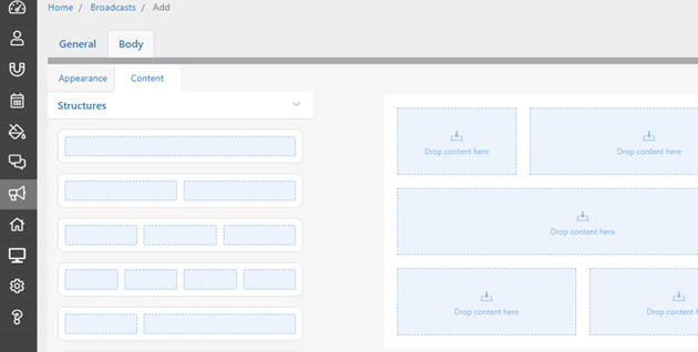
Content Sub-tab
-
Structures – select the content structure you want and drag-and-drop to the stripe you wish to place it in (header, content, footer, info area). Options include one, two, three or four equal columns,
or two offset columns. Once you’ve added your containers to your content on the right side you can further configure that specific instance.
- Click on a container – when you click on a container, the following settings for that specific container will appear under Structures:
- Background color of container – use to set the background color of the container. Default value is transparent.
- Background image – toggle on to select and add a background image you your container. Default value is off.
- Rounding – use to set the border-radius of the container, giving it round corners.
- Border - select a border type from the dropdown (options are solid, dashed and dotted). Select a border color using the color picker.
- Hide element - use to set whether the container can always be seen, is hidden on desktop, or is hidden on mobile using the buttons. Default setting is "No."
- Include in - use to set whether the container is included in both MIME versions of the email message, classic HTML, or AMPHTML using the buttons. Default setting is "Both."
- Click on a stripe – when you click on a stripe, the following settings for that specific stripe will appear here under Structures:
- Message area – use to select the type of stripe. Options are Header, Content, Footer, and Info area.
- Stripe background color - use to set the background color of the Header stripe. Note that the background color will span the entire width of the page. The content area will
remain centered. Default value is transparent.
- Background color of content - use to set the background color of the stripe area only. Default value is white (#ffffff).
- Background image - use to add a background image to the stripe. The background image will only span the size of the stripe content area.
- Border of content – use to set the values of a border around the content areas with the stripe. Default value is off.
- Hide element - use to set whether the stripe can always be seen, is hidden on desktop, or is hidden on mobile using the buttons. Default setting is "No."
- Include in - use to set whether the stripe is included in both MIME versions of the email message, classic HTML, or AMPHTML using the buttons. Default setting is "Both."

- Blocks – select the block element you want and drag-and-drop to the container you wish to place it in. Once you’ve added a block to your container you can click it there to access settings
for that specific block.
- Image – use to add an image element to a container via drag and drop. After adding to a container, click on image block again to access the image upload widget. Once you’ve uploaded your
image, click on the image block again to access the following settings:
- Image path – the url path to your image file.
- Link – hyperlink your image by adding a URL, mail, telephone, social media or other link.
- Alternate text – use to add alt text to your image, which is essential for SEO and ADA compliance.
- Alignment – use to adjust the alignment of the image in the container. Choose from left, center and right.
- Size – use the horizontal and vertical arrow buttons to adjust the width and height of the image.
- Adjust to width – toggled on by default.
- Responsive image – toggle on to allow the image to adjust to the width of the screen on mobile devices.
- Padding – use to set the amount of padding around the image. Toggle on the More button to set different values for top, right, bottom, and left sides.
- Add an anchor link – toggle on and add anchor name to set up as part of an inner-page navigation
- Hide element – use to set whether the image can always be seen, is hidden on desktop, or is hidden on mobile using the buttons. Default setting is "No."
- Include in – use to set whether the image is included in both MIME versions of the email message, classic HTML, or AMPHTML using the buttons. Default setting is "Both."
- Text – use to add a text element to a container via drag and drop. After adding to a container, click on text block again to access the following settings:
- Text color – use to set the color of the text in the text block. Default value is dark gray (#333333). Make sure your text color offsets the background and doesn’t blend in.
- Background color – use to set the background color of the text block. Default value is transparent.
- Alignment – use to adjust the alignment of the image in the container. Choose from left, center and right.
- Line spacing – use to set the vertical spacing between lines in a paragraph. There are 4 buttons to select from, ranging from condensed text to double-spaced.
- Padding – use to set the amount of padding around the text element. Toggle on the More button to set different values for top, right, bottom, and left sides.
- Add an anchor link – toggle on and add anchor name to set up as part of an inner-page navigation
- Hide element – use to set whether the text can always be seen, is hidden on desktop, or is hidden on mobile using the buttons. Default setting is "No."
- Include in – use to set whether the text block is included in both MIME versions of the email message, classic HTML, or AMPHTML using the buttons. Default setting is "Both."
- Button – use to add a button element to a container via drag and drop. After adding to a container, click on button block in your content to access the following settings:
- Link – hyperlink your button by adding a URL, mail, telephone, social media, or other link.
- Button label – use to specify the label text that appears on the button. For example, “Send.”
- Text style – use to select the font family (i.e., Arial, Georgia, etc.), the font size, make bold or style as italic the button’s label.
- Button color – use to set the color of the button. Make sure your button color and text color contrast and don’t blend.
- Text color – use to set the color of the button text label. Default value is white (#ffffff). Make sure your text color offsets the button color and doesn’t blend in.
- Background color – use to set the background color of the block behind the button (not the button itself). Default value is transparent.
- Border radius – use to set the roundness of your button’s corners.
- Alignment – use to adjust the alignment of the button in the container. Choose from left, center and right.
- Button with icon – toggle on to add an icon to the button and label. Align the button to the left or the right of the label. Upload your icon. Note: this feature will not work
with several versions of Windows Outlook.
- Adjust to width – toggle on to force the button to span the width of its container.
- Border – select a border type from the dropdown (options are solid, dashed and dotted). Select a border color using the color picker.
- Internal padding – use to set the amount of space between the button’s label and the edges of the button container.
- External padding – use to set the amount of space between the outside of the button and the edge of the container that it sits in.
- Add an anchor link – toggle on and add anchor name to set up as part of an inner-page navigation.
- Hide element - use to set whether the button can always be seen, is hidden on desktop, or is hidden on mobile using the buttons. Default setting is “No.”
- Include in - use to set whether the button block is included in both MIME versions of the email message, classic HTML, or AMPHTML using the buttons. Default setting is “Both.”
- Spacer – use to add a spacer element to a container via drag and drop. After adding to a container, click on spacer block in your content to access the following settings:
- Dynamic spacer – toggle on to stretch the spacer to the desired height. Default setting is off.
- Background color of block – use to set the background color of the spacer block.
- Line – use to set the thickness, line type (solid, dashed, dotted) and color of the spacer line
- Width – use to set the width of the spacer. Value is a percentage. Default value is 100.
- Alignment – use to adjust the alignment of the spacer in the container. Choose from left, center and right.
- Responsive spacer – toggle on to allow the spacer to adjust to the width of the screen on mobile devices. Default setting is on.
- Padding – use to set the amount of padding around the spacer element. Toggle on the More button to set different values for top, right, bottom, and left sides.
- Add an anchor link – toggle on and add anchor name to set up as part of an inner-page navigation
- Hide element – use to set whether the spacer can always be seen, is hidden on desktop, or is hidden on mobile using the buttons. Default setting is "No."
- Include in - use to set whether the spacer block is included in both MIME versions of the email message, classic HTML, or AMPHTML using the buttons. Default setting is "Both."
- Video – use to add a video link to a container via drag and drop. After adding to a container, click on the video block in your content to access the following settings:
- Link to video – use to add the url of your video (on YouTube, Vimeo, VK, etc)
- Alternate text – use to add alt text to your video block, which is essential for SEO and ADA compliance. When you add the link to your video the editor will automatically populate this field.
- Custom thumbnail – use to upload a custom image to serve as the thumbnail for your video before the user presses play. You may even insert an animated GIF as the thumbnail image if you like.
- Play button – use to select the color of the play button. Choose from several colors and styles.
- Alignment – use to adjust the alignment of the video block in the container. Choose from left, center and right.
- Size – use the horizontal and vertical arrow buttons to adjust the width and height of the video.
- Adjust to width – toggle on to force the video to span the width of its container. Default value is on.
- Responsive image – toggle on to allow the video block to adjust to the width of the screen on mobile devices.
- Padding – use to set the amount of padding around the video element. Toggle on the More button to set different values for top, right, bottom, and left sides.
- Add an anchor link – toggle on and add anchor name to set up as part of an inner-page navigation.
- Hide element – use to set whether the video can always be seen, is hidden on desktop, or is hidden on mobile using the buttons. Default setting is "No."
- Include in - use to set whether the video block is included in both MIME versions of the email message, classic HTML, or AMPHTML using the buttons. Default setting is "Both."
- Social – use to add social media icons and links to a container via drag and drop. After adding to a container, click on the social block in your content to access the following settings:
- Background color – use to set the background color of the block behind the social network icons. Default value is transparent.
- Social icon style – select from several different shapes and colors of icons, upload custom icons, and set icon size.
- Facebook – use to add a link to your Facebook page, add a title and alt tag, or delete from the social block in the container.
- Twitter – use to add a link to your Twitter page, add a title and alt tag, or delete from the social block in the container.
- Instagram – use to add a link to your Instagram page, add a title and alt tag, or delete from the social block in the container.
- YouTube – use to add a link to your Instagram page, add a title and alt tag, or delete from the social block in the container.
- Alignment – use to adjust the alignment of the social network block in the container. Choose from left, center and right.
- Indent between icons – use to set the amount of horizontal space between the icons.
- Padding – use to set the amount of padding around the social network element. Toggle on the More button to set different values for top, right, bottom, and left sides.
- Add an anchor link – toggle on and add anchor name to set up as part of an inner-page navigation.
- Hide element – use to set whether the social networks block can always be seen, is hidden on desktop, or is hidden on mobile using the buttons. Default setting is "No."
- Include in - use to set whether the social networks block is included in both MIME versions of the email message, classic HTML, or AMPHTML using the buttons. Default setting is "Both."
- Banner – use to add a banner element to a container via drag and drop. After adding to a container, click on banner block again to access the image upload widget. Once you’ve uploaded your
image, click on the banner block again to access the following settings:
- Orientation – use to set the orientation of the banner image. Select from vertical, square, and horizontal.
- Banner height – use to specify the height of the banner. Default value is the height of the image you use.
- Filter – use to modify the banner image with several pre-configured effects, including blur, contrast, and color filter.
- Link – hyperlink your banner image by adding a URL, mail, telephone, social media, or other link.
- Alternate text – use to add alt text to your banner block, which is essential for SEO and ADA compliance.
- Additional picture – toggle on to add an additional picture to the banner. This additional picture will overlay the main banner image. Default value is off.
- Add an anchor link – toggle on and add anchor name to set up as part of an inner-page navigation.
- Hide element – use to set whether the banner block can always be seen, is hidden on desktop, or is hidden on mobile using the buttons. Default setting is "No."
- Include in - use to set whether the banner block is included in both MIME versions of the email message, classic HTML, or AMPHTML using the buttons. Default setting is "Both."
- Menu - use to add a menu element to a container via drag and drop. After adding to a container, click on the menu block in your content to access the following settings:
- Menu type – use to select the style of menu. Choose from text links, icon links or icon and text links combined.
- Separator – use to add a separator line between each menu link. Choose the line thickness, the line style (solid, dashed, or dotted) and the separator line color. Default value is 0 (off).
- Text style – use to select the font family (i.e., Arial, Georgia, etc.), the font size, make bold or style as italic the button’s label.
- Links color – use to set the font color of hyperlinks in menu element.
- Padding – use to set the amount of padding around the menu element. Toggle on the More button to set different values for top, right, bottom, and left sides.
- Add an anchor link – toggle on and add anchor name to set up as part of an inner-page navigation.
- Include in – use to set whether the menu block is included in both MIME versions of the email message, classic HTML, or AMPHTML using the buttons. Default setting is "Both."
- Item -
- Item name – type the link name.
- Link – copy and paste the url the menu item links to.
- Links color – set the color of the link.
- Background color of item – use to choose a background color for the link. Default value is transparent.
- Hide element - use to set whether the menu item can always be seen, is hidden on desktop, or is hidden on mobile using the buttons. Default setting is "No."
- Add menu item button – click button to add more menu items. Default number of menu items is 3.
- HTML – use to add a html block element to a container via drag and drop. After adding to a container, click on the HTML block in your content to access the following settings:
- HTML editor – use to write your own html and css code. For HTML experts – your code can affect the entire email message view.
- Padding – use to set the amount of padding around the HTML element. Toggle on the More button to set different values for top, right, bottom, and left sides.
- Hide element – use to set whether the HTML block can always be seen, is hidden on desktop, or is hidden on mobile using the buttons. Default setting is “No.”
- Add an anchor link – toggle on and add anchor name to set up as part of an inner-page navigation.
- Include in - use to set whether the HTML block is included in both MIME versions of the email message, classic HTML, or AMPHTML using the buttons. Default setting is “Both.”
- Modules – Your saved modules are listed here.
Editing Area

The Editing Area is your canvas for designing and building your message. Drag and drop Structures to the Header, Content or Footer
Stripes in the Editing Area to build the layout. Then, use Blocks to add your content by dragging and dropping the appropriate content type to the desired containers. Click on the
Container to edit the properties for each Block once you've added content. Click and drag within the Editing Area to move content up or down. You can simplify building your message by
following these steps:
- Gather and/or create assets - Edit any images and logos you plan to use by cropping and sizing to fit your message. Any banner images should be no larger than 600px wide to fit the message. Type
out the text parts of your message using your favorite word processing app to work out grammar and length ahead of time.
- Sketch your layout – strategize how you'd like your message content to be laid out. You can draw boxes on a piece of paper, also known as a wireframe, to organize your content. Use the available
Structures in the Broadcast message editor for reference in your layout design.
- Use Structures to build layout in Broadcast – drag and drop the structures you wish to use Header, Content and Footer stripes in the
Editing Area until you've reproduced your layout sketch in your Broadcast message.
- Use Blocks to add your content - drag and drop the appropriate content block to the Container you wish to add it to. Click on the Container to edit your content. Repeat
this process until you've added all of the content to your Broadcast message.

- Preview, Send, Save or Schedule your message - when you're done creating your Broadcast message, click on the Send button and choose to either Preview your
message, Send the Broadcast immediately, Schedule a date and time for the Broadcast to send or Save as Draft.
- Preview – click to preview your message (will open a popup window). Here, you will see a preview of your message. You also have the option to send a test email message.
- Send a test email – enter an email address (usually yours) into the Email broadcast to field and click Send Test. Check your email to see what the message
will look like to your clients. If you don’t see the test email in your inbox, check your Spam folder
- Send – click to send your Broadcast email message immediately. You will receive a pop-up notification at the bottom of your screen when it has successfully sent. You will also see information for
the message appear in Broadcasts panel on your Broadcast dashboard.
- Schedule – click to select the date and time you wish your Broadcast email message to be sent.
- Save as Draft – click to save a draft of your message. You will receive a pop-up notification at the bottom of your screen when it has successfully sent. You will also see information for the saved
message appear in the Drafts panel on your Broadcast dashboard.